THE BRIEF
After all the stargazing with
Type&Space, we can finally relax our necks and adjust our sights back to this strange planet we call Earth.
This feels like a good moment to reassess and question conventional norms of beauty and perfection.
For the occasion, we are going on a weird field trip together:
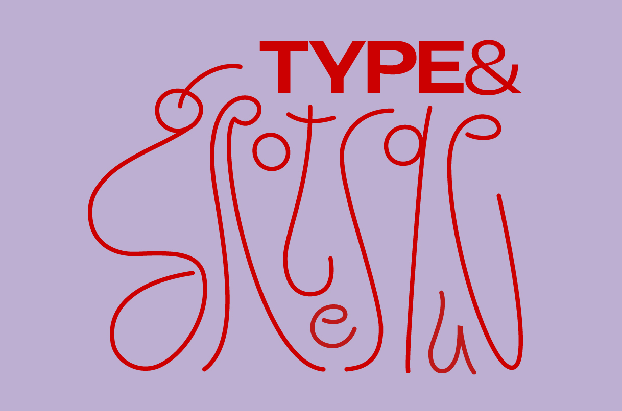
"Grotesque" describes something unnaturally odd, bizarre, or absurdly distorted. It’s a jarring mix of elements that shouldn't belong together, striking a delicate balance between the ugly and the artistically fascinating.
In the 1800s, the first commercial wave of sans-serifs was deemed “grotesque” simply because it lacked the elegant serifs of traditional typefaces. Strange how things change with time. What was once considered awkward made its way to the mainstream.
Now, it’s time to celebrate the weird, the bizarre, and the beautifully ugly.
How can this inspire a poster? As always, what your message says is entirely up to you. We encourage deep research and raw self-expression.
Here are a few ways to get weird:
Explore the fine line between elegant and hideous.
Warp, bend, or liquefy forms to provoke a visceral reaction.
Explore visual discomfort, disharmonious grids, awkward spacing, and compositions that refuse to play nice.
Embrace the friction. Make something that makes people stop and stare.
We are psyched to see what you come up with!
Download template here
Dimensions: A3 (297x396.5) with 3mm bleed
300 DPI, PDF, indesign file
2 Colours only (please make sure they are divided)
Outline all text include all links.
Please note: posters will be riso printed.
To enter, send us your artwork at
hey@typeandfaces.com including a short description of your design. Please include links to your social media.
